Screen printing usually suits broad, flat graphics and designs built from distinct areas of color; embroidery is often the stronger fit for a compact mark that should look stitched and dimensional. The right choice depends on more than preference: consider the artwork, how it will be produced, the garment surface, and where the design needs to sit.
Start with the finish and the artwork
Screen printing lays ink onto the fabric surface, so it can reproduce graphic shapes and color blocks without adding stitched texture. That makes it a natural option for a large back illustration, a bold event graphic, or artwork whose identity depends on distinct printed colors. A design with several separated elements can also take advantage of the space available on a flat panel.
Embroidery constructs the image with thread. The result has visible texture and dimension, which can make a small chest emblem feel like a sewn part of a uniform or team garment rather than a flat graphic. The thread path has to represent the original artwork, however. Tiny lettering, very fine lines, and smooth color gradients may need to be simplified because stitches cannot reproduce every detail in the same way ink can.
Imagine a club shirt with a small crest on the front and a sweeping illustration across the back. The crest may benefit from a stitched finish, while the larger illustration may read more clearly as a print. Thinking about the look and scale of each design area gives you a more useful starting point than asking which method is universally better.
Consider how the design is produced
Screen printing uses a screen for each ink color in the design. More colors therefore add setup steps, while repeating the same artwork across a larger run can spread that setup across many garments. A simple one- or two-color graphic is straightforward to evaluate visually; a complex piece with many colors and placements needs a closer look at how the artwork will be separated for printing.
Embroidery begins with digitizing: a stitch file maps the artwork into a sequence the embroidery machine can sew. The amount and direction of stitching, along with the design’s density and detail, shape the production work. A clean, compact logo is often easier to translate than intricate artwork with narrow gaps or tiny text. When comparing concepts, look at the proposed stitch version rather than assuming the original screen or vector artwork will transfer unchanged.
These different setup demands also affect how you think about repeat orders. If the same graphic will appear on a substantial group of garments, screen-printing setup may make sense across the run; for a stitched emblem, the digitized design provides the production map. The number of colors alone does not settle the decision: ask how the actual artwork will be prepared in the chosen process.
Match the method to the garment and placement
Embroidery adds thread and backing to the garment, so fabric weight and structure matter. A sturdier material generally supports stitches more comfortably than a very light or delicate one. On a thin shirt, a dense stitched design can feel heavy or cause the area to pucker; the garment and size of the mark should be considered together.
Screen printing needs a relatively flat, accessible surface for the screen and printing process. A broad front or back panel can offer room for a larger graphic, while seams, pockets, and curved areas can limit where the design fits. Placement is not just a matter of moving artwork on a mockup: the physical garment has to allow the intended area to be decorated cleanly.
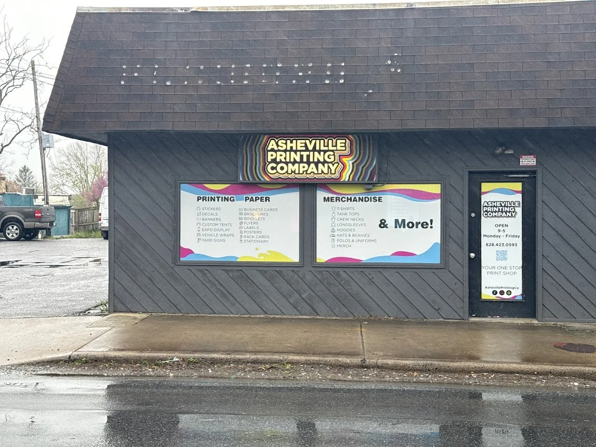
Before settling on a method, picture the actual garment being worn and handled. A small mark on a structured polo and a large image on a lightweight tee ask different things of both material and decoration. Asheville readers looking for a print shop can consider Asheville Printing Company.
Use both when one method cannot do both jobs
A single garment does not have to use one decoration process everywhere. For example, a small embroidered chest mark can establish a neat, dimensional identity, while a larger screen-printed back graphic carries a more expansive illustration. Each method then serves the part of the design it handles best instead of forcing one treatment to do two different jobs.
Plan a mixed-decoration piece as two related design decisions. Specify the placement, size, and intended appearance of each element separately, then review how they work together on the garment. The chest logo may need a simplified stitched version, while the back art retains its printed color and scale. Check that both versions preserve the recognizable parts of the brand artwork and that their positions feel balanced when viewed together.
In practical terms, choose screen printing when the visual priority is a broad, flat graphic with clear areas of color; choose embroidery when the priority is a raised stitched mark and the garment can support it. When a design contains both needs, assign each area its own method. That criterion makes the decision specific to the artwork and garment rather than a blanket preference for one technique.